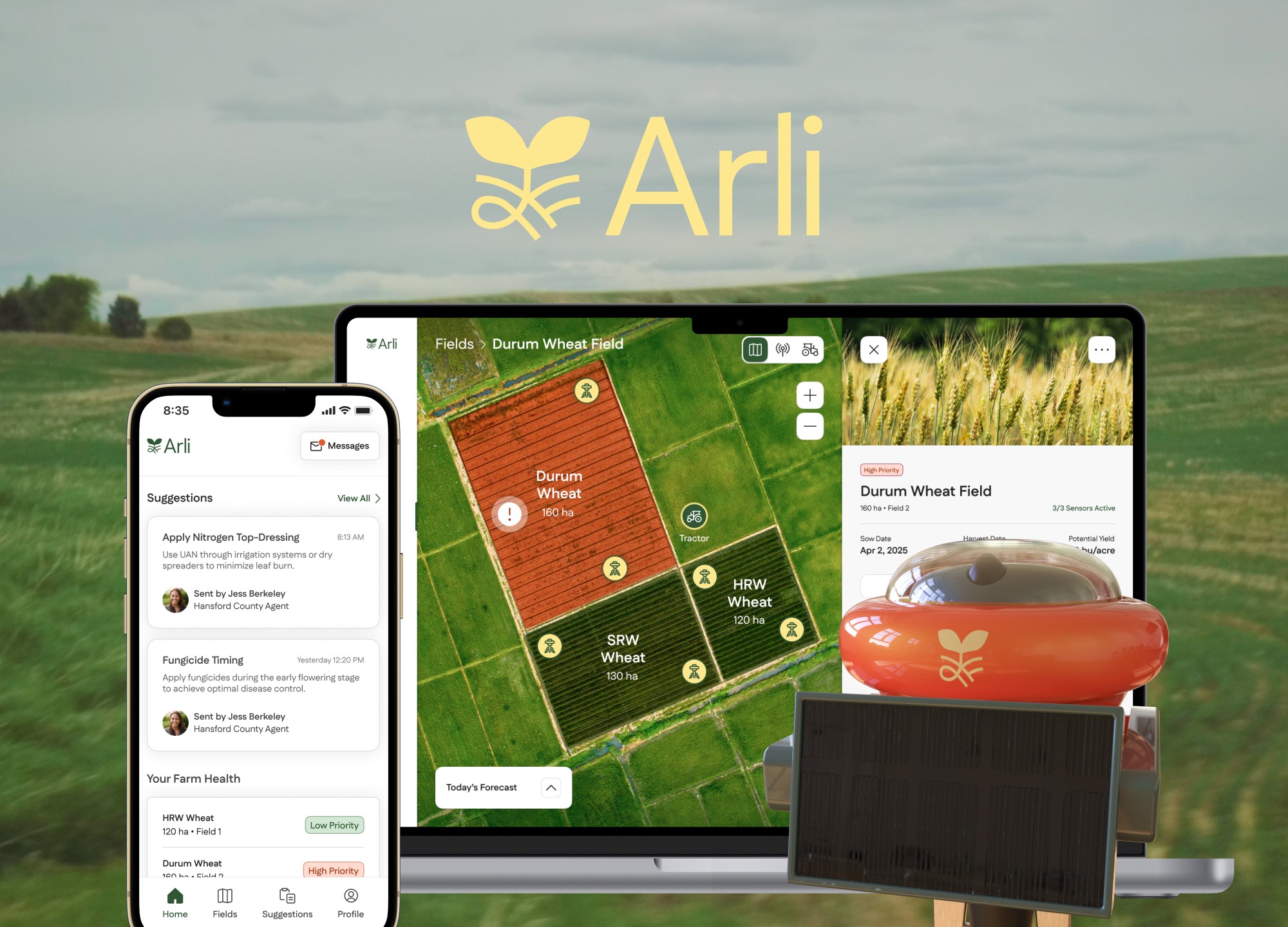


Remedi is a platform designed to improve medical patients’ healthcare journey with its innovative ecosystem, which includes effortless appointment scheduling and comprehensive transcript record-keeping. Remedi places the control of your well-being into your own hands.
THE TEAM
Chloe Au Yeung
Ellie Fowler
Angelia Legaspi
Santos Torres
MY ROLES
UI Designer
Interaction Design Lead
UX Researcher
TOOLS
Figma, Adobe Suite, Rhino 3D, Keyshot
TIMELINE
Jan - Mar 2024 (10 Weeks)
So, what’s this about?
Have you ever felt that booking a medical appointment was difficult?
Have you ever struggled to retain information conveyed by your health provider after an appointment?
From booking it, to communicating with your provider, to remembering your next steps afterwards:
Medical appointments can be overwhelming.

Problem Statement
Identifying the issue
Medical appointments can be stressful. Without reminders, patients typically retain only around 49% of the information conveyed by their doctors. Patients experience confusion and discomfort due to a lack of understanding and miscommunication between them and their healthcare providers.
1. Baseline Assessment - Secondary Research
Statistics
By the numbers

30%
of all medical appointments are missed or canceled.
51%
of patients feel their provider don't fully explain things in an understandable way.
1 in5
patients say they left an appointment confused or uncertain about their diagnosis or next steps.
Surveys
What do patients say?
We sent out a survey to inquire about patients’ experiences with going to a medical appointment.
We noticed repeating keywords from their responses such as:
Time
Respect
Communication
Patience
Transparency
What about medical officers?
We also sent out a survey to inquire about medical officers’ experiences with preparing for a medical appointment.
50% of participants strongly agreed that getting required patient documents is unpredictable, and some said that the electronic health documentation process negatively influences their overall work satisfaction.
Diary Studies
A week with the users
We asked 5 medical officer staff and 6 patients to participate in diary studies about the before, during and after of medical appointments to understand the user journey of both patients and medical staff.
From the diary studies, we created user journey maps for both patients and medical staff to analyze the tasks, emotions and pain points that they experience about medical appointments.

Patient

Medical staff

2. Diagnosing The Condition - Analysis
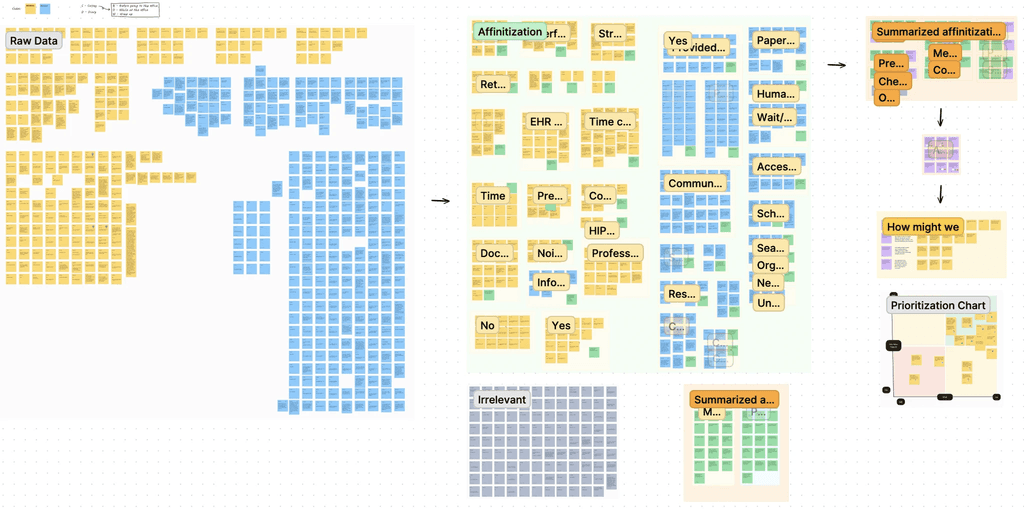
Affinity Mapping
Finding the common pulse
We gathered all the data from our survey and diary studies and affinitized the data.
From this we were able to come up with our possible areas of opportunities and our how might we statement.
How Might We Statement
Asking the key question
How might we...
improve communication between doctors and patients to ensure patient understanding of their own health while providing a seamless documentation structure?
Target Audience
Meet our personas

(1)
Patient - Hank
"I find it challenging to effectively voice my concerns to the doctor about my health."
Hank’s health has been generally stable, but he has noticed some new symptoms that concern him, such as dizziness and difficulty sleeping.
Goals and Objectives
Understand his medical conditions and treatment plans in simple terms
Maintain an active lifestyle
Address his recent health issues
Pain Points
Not particularly tech-savvy
Overwhelmed by medical terminology
Feels rushed and still has questions after appointments
Preferences
Clear and concise information
Transparent communication between him and his doctor

(2)
Medical Officer - Molly
"I feel slowed down by the difficulty of navigating through the current electronic health documentation system."
Molly is a medical assistant who works at a primary care office. A large part of her duties include documenting patient information.
Goals and Objectives
Streamlining the documentation process
Integrating technology
Making systems accessible for patient use
Pain Points
Outdated systems that are difficult to navigate
Monotonous process
Human error is unavoidable
Preferences
User-friendly interface for accurate data entry
Easy collaboration among coworkers
Opportunity Areas
Where change can happen
After understanding the needs of our users, we found 4 opportunity spaces where we can make a difference.
Provide a summary of the diagnosis and treatment plan
Remind patients of appointments and what they need to bring
Use technology for real-time updates on appointment status
Define language on forms to enhance patient understanding
What if patients were able to have a
full record of their appointment that they can view and listen afterwards?
3. Prescribing Possibilities - Ideation
Early Concepts
Where the ideas started
We decided to create an app prototype, a physical prototype and a desktop application prototype for our solution.
App prototype: Allowing patients to view their appointment records with transcripts
Desktop prototype: Allowing medical physicians to also view the patient’s appointment records with transcripts
Physical prototype: A pin that medical physicians wear which records the appointment with transcripts
Mid-fi Wireframes
Designing the flow of care
As the UI designer, I drafted lo-fi wireframes of our App and Desktop Platform to better visualize our concepts. I also ensured that the UI design includes accessibility and follows WCAG guidelines.
Our team developed the layout, functionality and information architecture of the app, along with exploring different shades of grey for visual hierarchy. We also 3D modelled the shape of our physical pin.

App

Physical Pin
Once we had our initial idea and wireframes, it's time to see if our concept resonated with our users.
4. Clinical Trials - Usability Testing
User Testing
Testing with real users
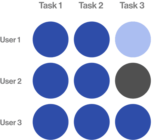
We conducted a round of user testing among 6 users. We created a set of tasks for users to complete within our app and asked them for feedback about what they liked, and what they think can be improved on.
Task Performance
Measuring task success
Round 1
Success
Struggle
Failure

Add a new note for upcoming appointment
Start a new transcript (Pair, Transcript)
View a past transcript
View a vocabulary term
Our key takeaways
We learned that…
Negative
Testers had a lot of difficulty finding past transcripts - Information architecture needed to be redone.
Wording for adding a new appointment was confusing. Users got two buttons confused.
Vocabulary terms need to be more accessible, took too many clicks to get to a definition.
Transcribe feature needs a bit more thought on how it will function in the actual office.
Positive
Home page had all of the information wanted out of a home page.
Transcribe was easy to find, and the process of pairing was understandable.
Appointments page is easy to digest and understand.
Keep it clean and simple going into hi-fi!
Iterations
Refining the product
Getting user input from testers allowed me to refine our features and interface, ensuring every detail was precise and intuitive.

Shortened transcript process
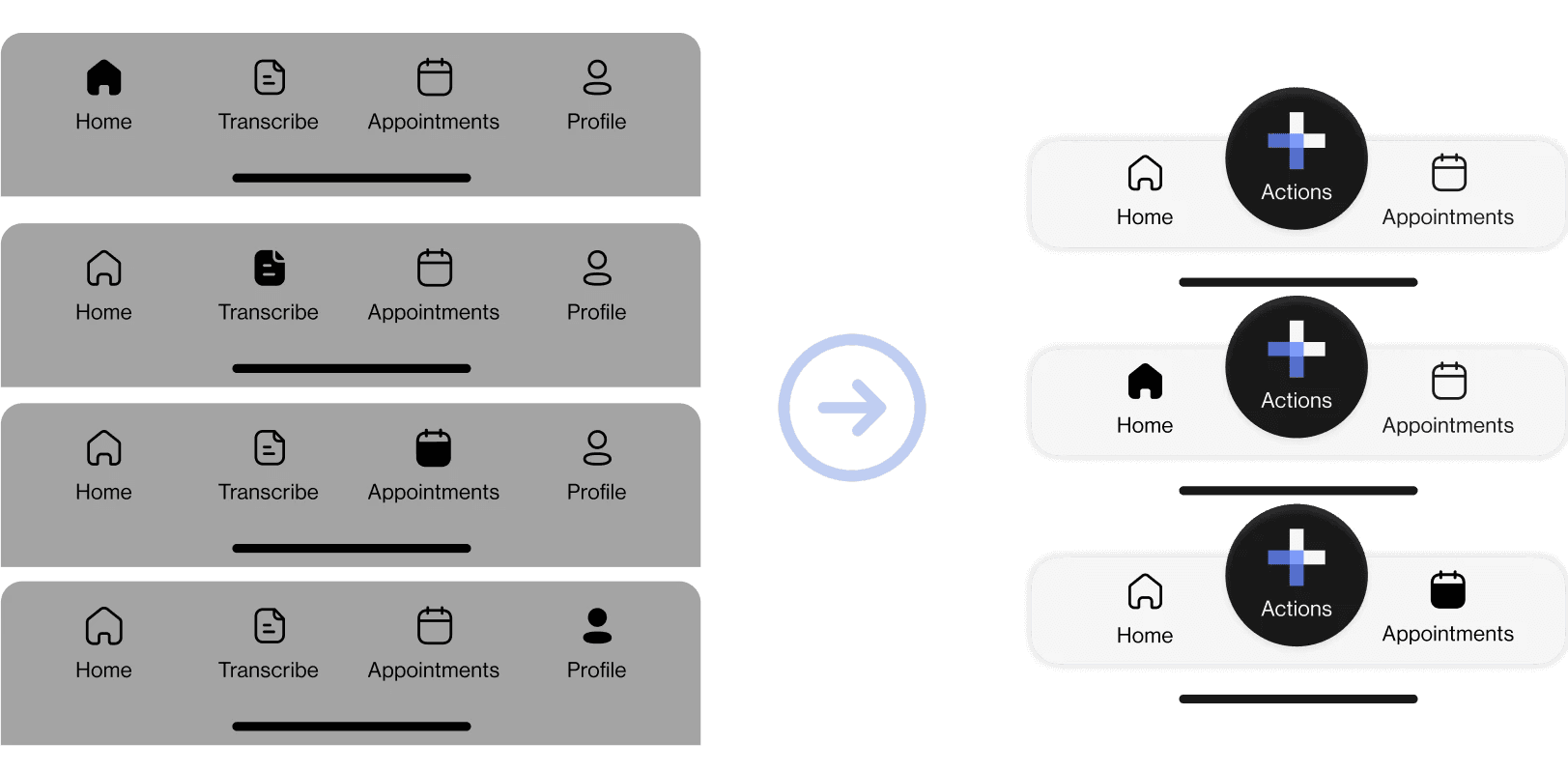
Nav bar changed

Moved the pause button

Homepage overhaul
User Testing
Round 2
We conducted another round of user testing among 3 users. We again created a set of tasks for users to complete within our app and asked them for feedback about what they liked, and what they think can be improved on.
Task Performance
Measuring task success
Round 2
Success
Struggle
Failure
Schedule a new appointment
Start a live transcription
View past transcript
Our key takeaways
We learned that…
Negative
Users still had trouble finding past transcripts. They struggled less than the first round of testing, but still struggled.
The day by day calendar on the schedule appointment screen did not make sense to users.
The confusion indicator button did not match the function. Users did not understand the use of the button.
Positive
Overall flow of the app made sense, users did not have any major concerns other than transcripts.
Screens were very scannable and readable, super easy to digest.
Scheduling an appointment was straightforward, a more unique feature that allows for more flexibility.
Users liked transcription as a unique feature that increases accessibility.
5. From Lab to Life - Final Concept
Hi-fi Wireframes
Ready for handoff

Solution
A platform for all, where clarity meets care
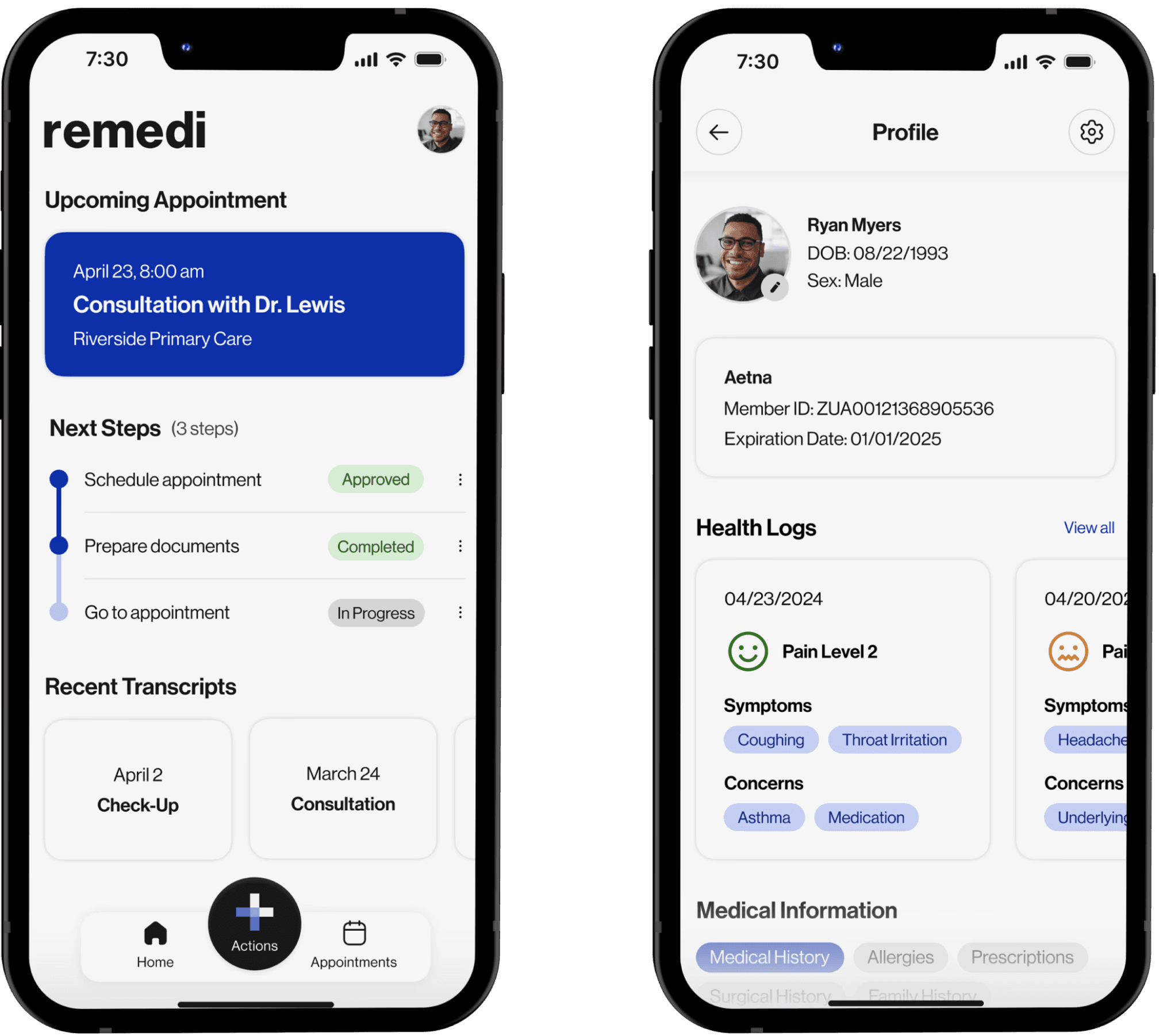
Accessible Anytime, Anywhere
Carry your medical history in your pocket. Access the app 24/7, ensuring your health information is available whenever you need it.
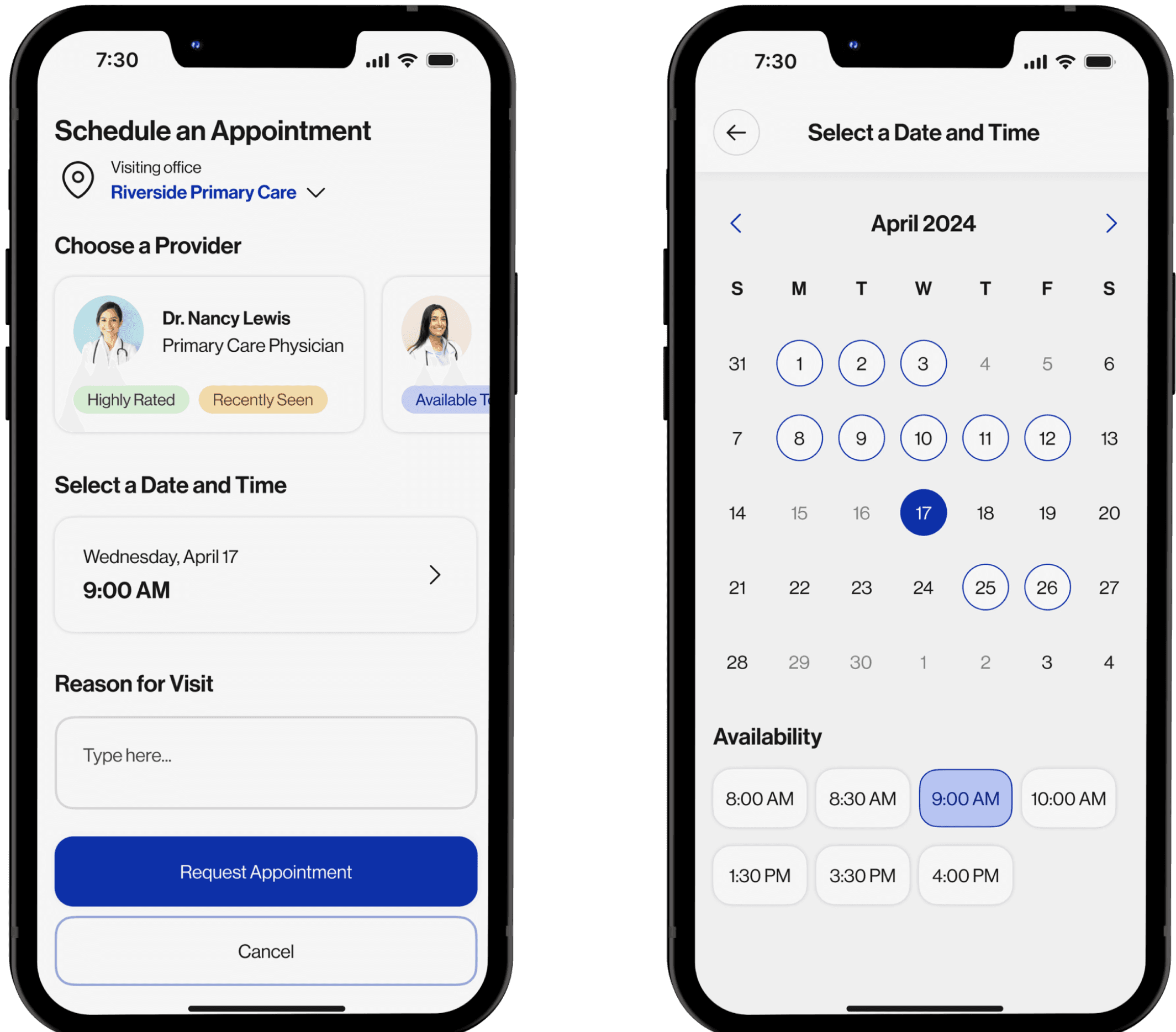
Seamless Scheduling
No more waiting on hold—book, cancel, or reschedule medical appointments effortlessly.
Efficient Record-Keeping
Experience hassle-free doctor visits with automated appointment transcripts. Easily mark and review definitions with your doctor.
Summarized Insights
Receive personalized summaries of each medical appointment to review key points at a glance.
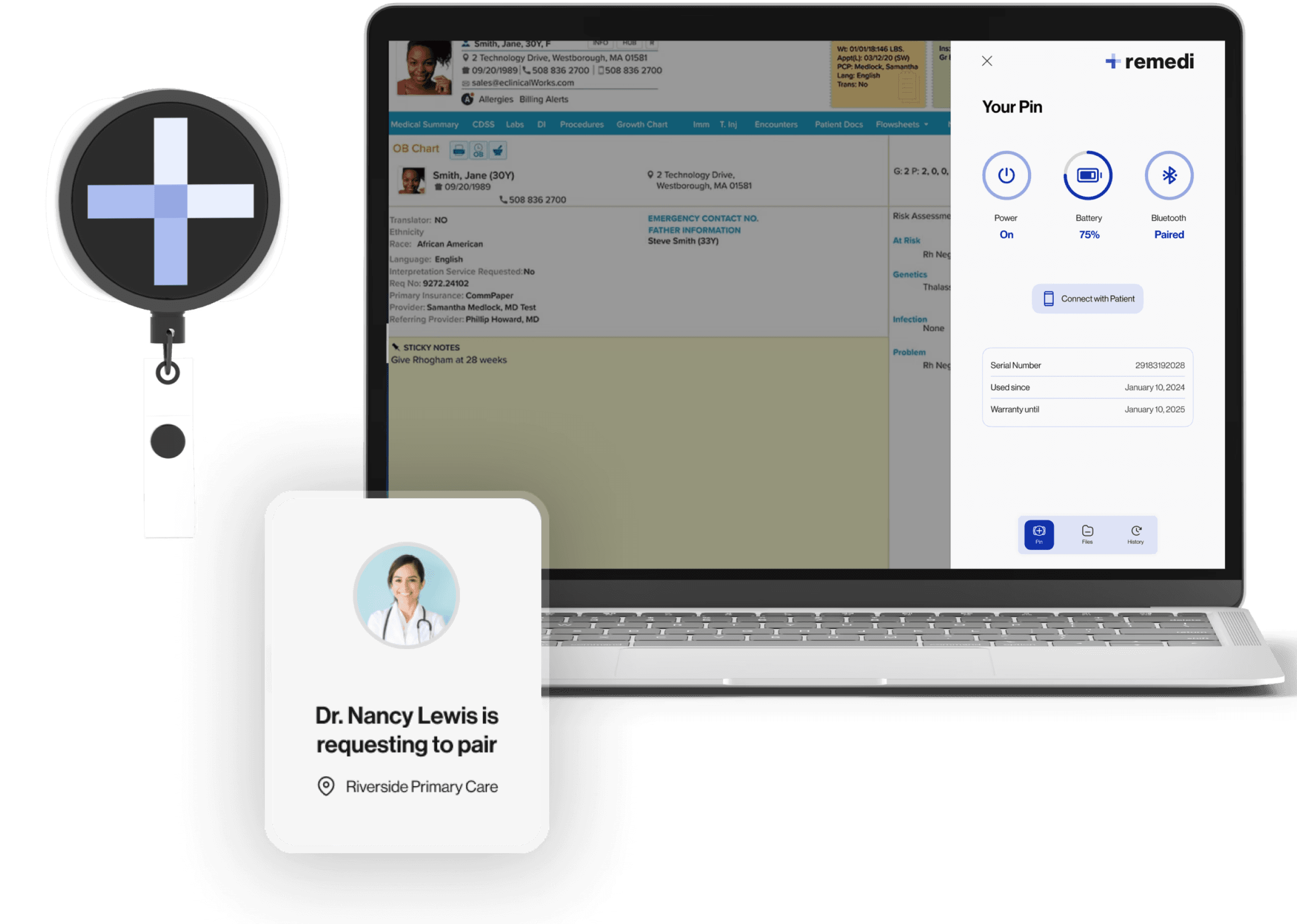
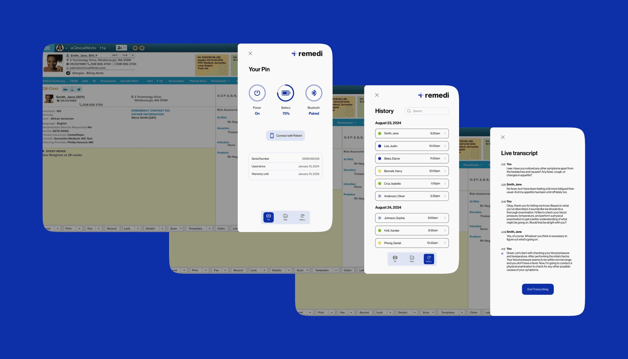
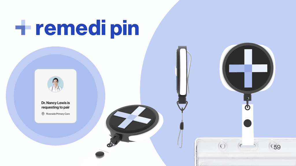
Pairing Your Pin
Healthcare providers can manage their pin from their desktop with the remedi plugin.
No need to learn a new EHR system, just install and access on the right hand side whenever needed.
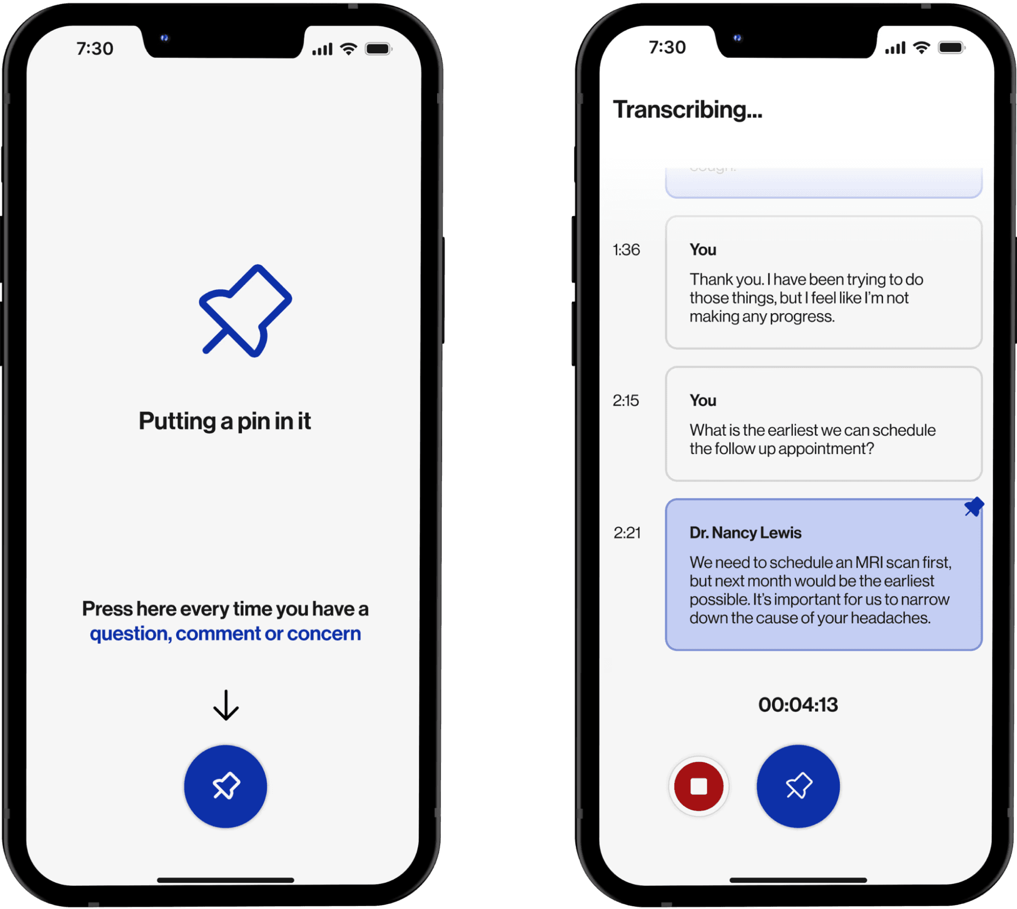
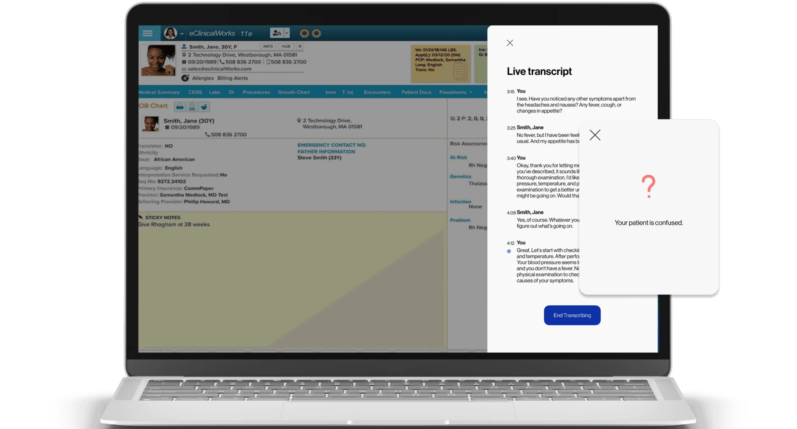
Live Transcript
Simplify the documentation process with automatic transcripts.
Receive realtime alerts when the patient is confused.


6. Clarity and Care
My Reflections
Looking back, moving forward
It’s normal to have set backs and pivot if needed
We have shifted our focus multiple times which led to us having to restart our directions for the wireframes and research. It was hard decision because we were running short on time within the 10 weeks, but the outcome of this project proved that our decision was worth it.
Understanding our users
As we are trying to improve a physical experience, it was crucial to do user research and understand the current experience in order to find areas of opportunities in improving it. User research in our project played an important role and making sure we were going in the correct direction, which included our problem pivot. It is always worth it to spend more time on user research to fully empathize and find the best solution for our users.
That’s a wrap — thanks for stopping by!
Hope you enjoyed the journey.
Check out my other projects •ᴗ•